Lazy Loading vs Eager Loading
How the HTML loading attribute defers images until needed — reducing load time, bandwidth, and improving SEO.
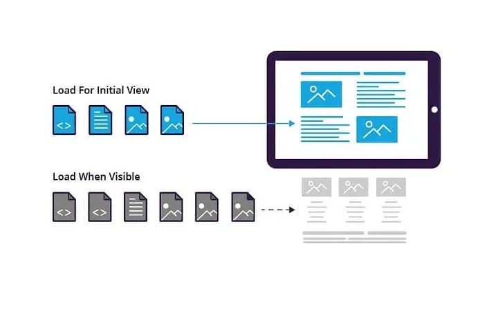
Lazy loading is a browser optimization that defers fetching images, iframes, and other below-the-fold resources until the user scrolls near them, instead of downloading everything the moment the page loads.
In modern browsers it is native: adding loading="lazy" to an <img> or <iframe> tag is all it takes — no JavaScript library required.
The browser tracks each deferred element's distance from the viewport and issues the network request only when the element is about to become visible, so images the user never scrolls to are never downloaded.
The payoff is a faster initial load, lower bandwidth use, and better Core Web Vitals scores.
The one hard rule: never lazy-load above-the-fold content — the hero image and anything visible on first paint should use loading="eager" (the default) so the Largest Contentful Paint element is not delayed, while everything further down the page loads progressively as the user explores it.
The Problem
By default, browsers load all images on a page immediately — whether the user will ever scroll to them or not. On a page with 50 images, this means 50 network requests on load (each one an HTTP GET request), most of them wasted on content below the fold.
The result: slower initial load, wasted bandwidth (especially on mobile), and a worse user experience for the content that actually matters — what's visible right now.
Lazy Loading
Lazy loading defers image and media loading until they approach the user's viewport. Resources below the fold are not fetched until the user scrolls near them. One attribute in HTML enables this natively:
<img src="image.jpg" loading="lazy" alt="Description">The browser tracks each image's position relative to the viewport and triggers a fetch only when it's within a certain distance of becoming visible.
How Does the Browser Decide When to Fetch a Lazy Image?
Each browser applies a distance-from-viewport threshold: once a lazy image is within that distance of the visible area, the fetch starts. Chrome tunes the threshold to the connection — on fast connections it prefetches images roughly 1,250 px ahead of the viewport, and on slow connections it starts even earlier (up to ~2,500 px) so the image is usually ready by the time the user reaches it. You don't configure any of this; the browser handles it.
What you do control is layout stability. Always declare width and height (or a CSS aspect-ratio) on lazy images so the browser can reserve the space before the file arrives — otherwise content jumps when the image pops in, hurting your Cumulative Layout Shift (CLS) score:
<img src="photo.jpg"
     loading="lazy"
     decoding="async"
     width="800" height="600"
     alt="Description">
Adding decoding="async" lets the browser decode the image off the main thread, keeping scrolling smooth while late-arriving images are processed.
Advantages
- Reduces initial page load time — fewer requests on first paint
- Conserves bandwidth — images never seen are never downloaded
- Improves SEO rankings — Core Web Vitals (LCP, FID) improve with faster loads
- Decreases browser workload — fewer decode/render operations upfront
- Better performance on low-bandwidth connections — especially important on mobile
- Optimizes resource utilization — server and client both work less on initial load
Disadvantages
- Inappropriate for small-scale applications — overhead not worth it with few images
- Placeholders during rapid scroll — can cause layout shift or blank areas
- Additional server round-trips — resources fetched on demand instead of batch
Eager Loading (Default Behavior)
Eager loading — the browser default — fetches all images immediately on page load, regardless of viewport position. It's the right choice for above-the-fold content: hero images, logos, critical visuals that should be ready instantly.
<img src="hero.jpg" loading="eager" alt="Hero image">When Does Lazy Loading Hurt Performance?
The most common mistake is lazy-loading the Largest Contentful Paint (LCP) element — usually the hero image.
A lazy-loaded image is invisible to the browser's preload scanner, so the request starts late, the largest visible element paints late, and your LCP score gets measurably worse.
Google's own guidance is blunt: images in the initial viewport should never carry loading="lazy".
Other cases where lazy loading works against you: the first slide of a carousel (visible immediately, yet often lazy-loaded by default in libraries), images just barely below the fold on short pages, and pages with only a handful of images where deferral saves nothing but still risks a visible pop-in during fast scrolling.
Lazy vs Eager: The Trade-offs at a Glance
| Aspect | Lazy loading | Eager loading (default) |
|---|---|---|
| Initial page load | Faster — only visible resources fetched | Slower — every image requested up front |
| Bandwidth | Only what the user actually sees | Full page weight, seen or not |
| LCP impact | Harmful if applied above the fold | Correct choice for the hero / LCP element |
| Layout shift risk | Present unless width/height reserved | Minimal — images load with the page |
| Fast scrolling | Possible blank placeholders | Content always ready |
| Best for | Long, image-heavy pages; mobile-first sites | Above-the-fold content; short pages |
When to Use Which
loading="eager": hero images, logos, above-the-fold critical visuals — load immediatelyloading="lazy": everything else — blog post images, gallery thumbnails, footer content- Small pages with few images: skip lazy loading — the overhead adds complexity without meaningful gain
- Image-heavy pages, long scrolls, mobile-first: lazy loading delivers the most impact
Do You Still Need JavaScript for Lazy Loading?
For images and iframes: no. Native loading="lazy" has shipped in every major browser since 2022 and needs zero code.
JavaScript earns its place when you lazy-load things the attribute can't cover — entire page sections, CSS background images, or components fetched over the network.
The tool for that is IntersectionObserver, which fires a callback when an element approaches the viewport:
const observer = new IntersectionObserver((entries) => {
  entries.forEach((entry) => {
    if (entry.isIntersecting) {
      loadSection(entry.target);        // fetch and inject content
      observer.unobserve(entry.target); // load once, then stop watching
    }
  });
}, { rootMargin: '200px' });            // start 200px before visibility

document.querySelectorAll('.lazy-section')
        .forEach((el) => observer.observe(el));
The rootMargin option mimics the browser's distance threshold: content starts loading 200 px before it scrolls into view, so the user rarely sees a placeholder.
This exact pattern powers the lazy-loaded sections on this site — the HTML for heavy sections is fetched only when you scroll toward them.